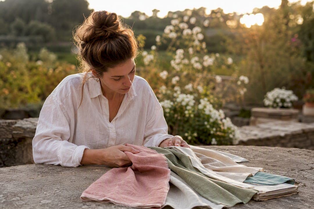
Stick to solid, muted neutrals or a coordinated palette of two to four colours, and keep faces the focal point rather than the wardrobe. A single deliberate pop of colour is fine and often flattering. Beyond that, your photographer will fine tune things on the day, so treat this as your starting point, not a rulebook carved in stone.
TL;DR:
- Neutrals like camel, stone, and navy reliably photograph well because they do not distract from facial expressions.
- Warm undertones suit camel, terracotta, and warm reds, while cool undertones are best complemented by navy, plum, and jewel blues.
- Coordinate outfits by choosing one anchor piece and pulling two to four complementary colors, limiting patterns and avoiding logo-heavy clothing.
- Bright colors, small patterns, and shiny fabrics can distort or distract in photos; careful checking with your phone in similar lighting settings helps prevent issues.
- Lighting conditions and fabric textures significantly affect how colors appear on camera, making pre-shoot tests and professional editing essential for true color fidelity.
Table of Contents
- Outfit colours for photos: the palette families that work every time
- Finding the best colours for your skin tone and undertone
- Coordinating outfits for pairs and groups without matching
- Colours and patterns to avoid and why
- Fabrics, texture and fit: what photographs best
- Footwear and accessories: completing the palette
- Seasonal and setting-based palette ideas
- Why lighting and fabric choice change how your colours actually appear
- Quick planning checklist for the day of your shoot
- Matching your palette to the style of the shoot
- How camera settings and editing change the way your outfit colours look
- How we help clients choose colours that photograph beautifully
- Ready to plan your outfit with a professional eye
- Sources
Outfit colours for photos: the palette families that work every time
Neutrals photograph reliably because they don't compete with skin tone or fight the light. Camel, stone, ivory, charcoal and soft navy sit quietly in a frame and let expression carry the image, which is why they turn up again and again in portrait photography advice aimed at keeping faces central. That's the real logic behind "timeless" wardrobe advice: it's not about being boring, it's about not distracting from the person in the photo.
Muted jewel tones add richness without the glare of their brighter cousins. Pastels (blush, sage, powder blue, soft lilac) suit softer, romantic settings and work particularly well for maternity or baby sessions where the mood is gentle rather than dramatic.
A few combinations worth borrowing directly include warm neutrals for outdoor sessions, cool muted palettes for studio headshots, jewel-tone pairings for editorial shoots, soft pastels for gentle settings, and monochrome with texture for sophisticated looks.
Match the palette to the mood you want, not just the season. A rustic barn wedding calls for warmer, earthier tones, while a clean studio headshot suits cooler, more controlled colours. If you're planning a personal branding session, lean toward the cool neutral palette above. It reads as polished and professional across every platform you'll use the images on.
Finding the best colours for your skin tone and undertone
The fastest way to check your undertone is the vein test: look at the underside of your wrist in natural light. Green veins usually mean a warm undertone, blue or purple veins suggest cool, and a mix of both points to neutral. A second check is the jewellery test: if gold jewellery flatters your skin more than silver, you're likely warm; if silver wins, you're probably cool.
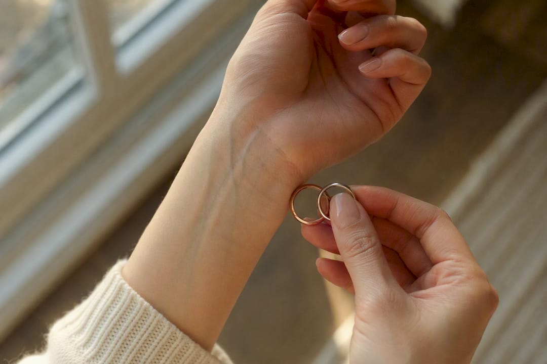
Warm undertones generally suit camel, olive, terracotta, mustard and warm reds. These colours photograph as rich rather than washed out. Cool undertones tend to look best in navy, charcoal, jewel blues, plum and true white, which sharpen contrast against the skin without overpowering it. Neutral undertones have the most flexibility and can usually wear both warm and cool families, though soft, muted versions of either tend to photograph best.
Where things go wrong is usually at the extremes. Warm undertones can look sallow in icy pastels or stark white. Cool undertones often look washed out in mustard or orange-heavy tones. If you're unsure, the neutral clothing test helps: hold a plain grey or white garment near your face and watch whether your skin looks brighter (cool undertone) or duller (warm undertone) against it. It's a rough guide, but a useful one when you're staring down a wardrobe at 7am before a shoot.
Coordinating outfits for pairs and groups without matching
Matching outfits (same colour, same fabric, head to toe) almost always reads as stiff in photos. Coordinated outfits, built from a shared palette rather than an identical one, look natural and put-together at the same time. Professional wardrobe guidance consistently favours this palette-first approach because it keeps everyone's individuality intact while still creating visual harmony.
- Pick one anchor outfit first. Usually this is whoever has the least wardrobe flexibility, like a partner who owns one good jacket, or the outfit already chosen for a specific reason (a wedding dress, a signature blazer).
- Pull two to three complementary colours from that anchor piece rather than trying to match it exactly.
- Limit the whole group to two to four colours total, mixing textures (a knit next to a linen shirt) and varying pattern scale so nothing competes.
- Place any pop of colour deliberately, on one person or one accessory, rather than scattering it across the group.
A simple balance heuristic worth remembering: aim for roughly a third neutral, a third muted colour and a third texture or pattern interest across the group, so no single element dominates the frame.
Pro Tip: If you're styling a family or bridal party, lay every outfit out on the floor or bed together before the shoot day. Colour clashes are far easier to spot from above than they are once everyone's dressed and out the door.
Colours and patterns to avoid and why
Neon and highly saturated colours often overwhelm skin tone and can cast unwanted colour onto the face, particularly under studio lighting. Tiny repeating patterns (fine stripes, small checks) can create a shimmering distortion known as moiré in digital photos, and busy patterns generally pull the eye away from expressions. Logos and text date an image quickly and rarely add anything to the story you're trying to tell.
Black and white can both work well, but each needs care: black can lose detail and texture in shadow areas, while white can blow out in bright sun, so pairing either with a mid-tone neighbour helps.
A few quick checks before you commit to an outfit:
- Photograph the garment on your phone in similar lighting to the shoot and zoom in, checking for shimmer or distortion in any pattern.
- Hold the outfit at arm's length. If the pattern reads as a blur rather than distinct shapes, it's likely too busy for the camera.
- Check for visible branding or text and swap it out if there is any.
Fabrics, texture and fit: what photographs best
Texture reads beautifully in photos, often more than colour does. Knits, linen, soft wool and lace all add depth and interest without competing with skin tone, and they photograph with a tactile quality that flat fabrics lack. High-shine synthetics, on the other hand, tend to reflect light unevenly and can create odd highlights or colour casts.
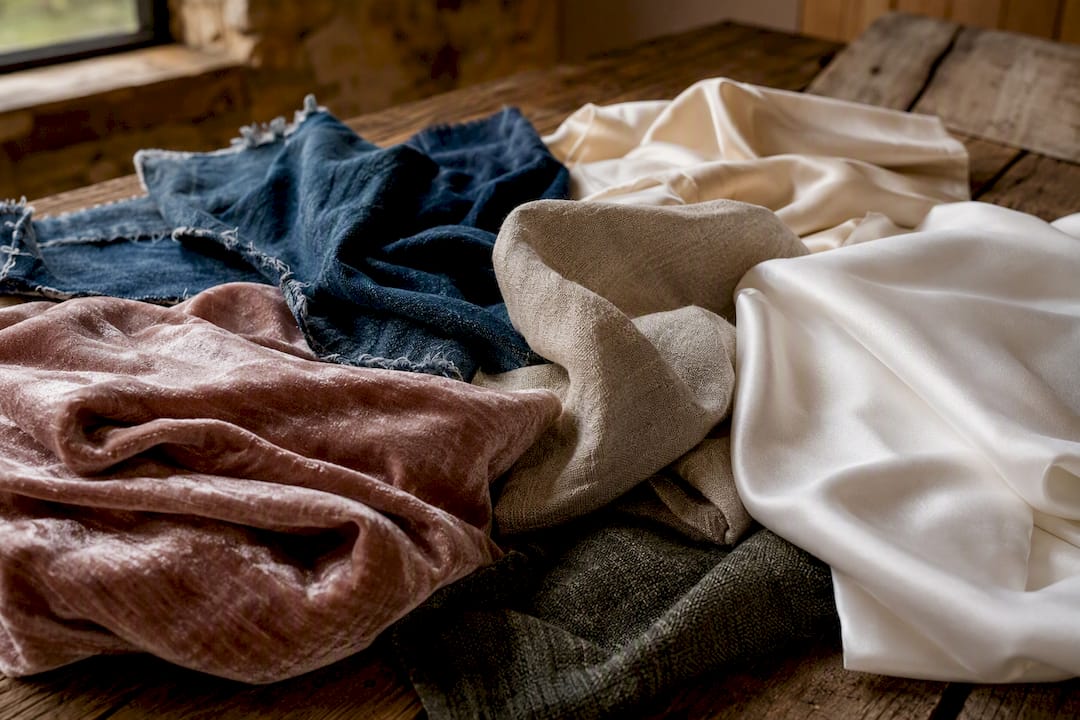
Fit matters just as much as fabric. Choose something that allows natural movement, since anything too tight will crease and pull in photos, while anything too loose can swamp your shape. As for colour consistency, different dye lots of the same "colour" can photograph slightly differently side by side, and fabrics with a pile (velvet, corduroy) can shift shade depending on which direction the nap is brushed, a detail worth checking in a mirror before you leave the house.
Footwear and accessories: completing the palette
Classic neutral shoes (tan, black, white leather) are the safest default, since they rarely distract from the outfit above them. Accessories, on the other hand, are your best tool for a controlled pop of colour or for tying a group's palette together with a shared scarf or tie shade. Save bright athletic shoes for shoots where they're an intentional style choice, not an afterthought.
Seasonal and setting-based palette ideas
Golden hour outdoor sessions suit warm, earthy palettes, camel, rust, olive, that echo the light itself. Studio sessions handle cooler, more saturated tones well because the lighting is controlled rather than shifting. Beach settings favour soft neutrals and pale blues that don't fight the sand and sky, while forest or bush settings can carry richer jewel tones like emerald or burgundy beautifully against green foliage.
- Golden hour: camel, terracotta, soft white.
- Studio: charcoal, jewel blue, deep plum.
- Beach: sand, powder blue, ivory.
- Forest: emerald, burgundy, warm brown.
Your background is doing half the work in every frame, so it pays to check what's actually behind you before locking in a palette. A cream outfit disappears against a white studio backdrop, and a green top can visually merge into bush scenery in a way that flattens the whole image. Run your final choices past your photographer ahead of time. They'll know the specific location or studio setup better than any general guide can.
Why lighting and fabric choice change how your colours actually appear
Colour on camera isn't fixed, it shifts depending on the light source and the fabric it's hitting. Controlled tests using standard colour reference charts have shown measurable colour differences depending on fabric and light combinations, meaning the same garment can read differently under studio strobes versus overcast daylight. This is part of why professional photographers plan lighting and colour harmony deliberately rather than leaving it to chance, as outlined in practical guidance on applying colour theory to portraits.
Fusing multiple directional lighting angles with standard colour calibration has been shown to lift textile colour fidelity significantly compared with single-source capture, a gap wide enough to explain why the same outfit can look subtly different across two photographers' galleries.
That figure comes from research on colour reliability in textile imaging, and it's a useful reminder for clients too. If you have a specific colour you need to nail (a brand colour, for instance), bring a swatch and ask for a quick phone test on location before the main shoot begins. Neutral palettes carry less risk here simply because there's less colour to shift in the first place.
Quick planning checklist for the day of your shoot
- Pack two outfit options per person, plus spare shoes, so a stain or a tear doesn't derail the session.
- Bring a small travel steamer or hang garments the night before to avoid last-minute creasing.
- Carry any coordinated swatches or accessories separately so they don't get crushed in transit.
- Do a quick phone test in similar light against a background close to your actual location before you commit to the final outfit.
Hanging garments on the way to the shoot, rather than folding them into a bag, is the simplest way to avoid arriving with a fresh set of creases to fight in editing.
Matching your palette to the style of the shoot
Candid, formal and editorial shoots each ask something different of your wardrobe, and the palette rules bend accordingly. Candid sessions, think lifestyle family shoots or engagement photos, tend to favour softer, more relaxed colours because the goal is authenticity over polish. Overly bold or graphic outfits can look staged in a genre built around natural movement and genuine interaction.
Formal portraits, such as corporate headshots or milestone family photos, benefit from a more restrained palette. Cooler neutrals and muted jewel tones photograph as composed and credible, which matters if the image is heading onto a company website or a formal announcement. This is where the cool neutral palette mentioned earlier does its best work, particularly for anyone booking a headshot session for professional use.
Editorial-style shoots have more room to play. Bolder jewel tones, unexpected colour pairings and stronger pattern choices can work because the whole point is visual impact rather than everyday authenticity. Even here, though, the same underlying rule applies: pick a palette with intention rather than throwing together whatever's bold in your wardrobe. A single striking colour against a simple neutral backdrop almost always reads better than three competing bold pieces fighting for attention in the same frame.
How camera settings and editing change the way your outfit colours look
White balance is the setting that decides whether your navy jacket reads as true navy or picks up a warm or cool cast from the light around it. A photographer shooting in mixed lighting, indoor tungsten bulbs plus daylight from a window, for example, has to make a judgement call on white balance that will shift every colour in the frame, including your outfit.
Aperture and depth of field matter too, though more subtly. A wide aperture that blurs the background can make outfit colours appear slightly more saturated by isolating them against a soft, out-of-focus backdrop, while a busier, sharper background can make the same colour feel visually diluted.
Post-processing is where a lot of the final colour accuracy gets locked in. Adjustments to saturation, white balance and skin tone during editing routinely shift how a garment's colour presents in the final image, and dye-lot inconsistencies or pile-direction issues in certain fabrics are often smoothed out here rather than on the day of the shoot. That's a normal part of a professional workflow, not a sign anything went wrong with your outfit choice. If you're after true-to-life colour in a final gallery, ask your photographer how they handle colour correction and monitor calibration during editing. It's a fair question, and a good photographer will have a clear answer.
How we help clients choose colours that photograph beautifully
We talk wardrobe through with nearly every client before a session, because the right palette makes our job easier and the results noticeably better. Clients who follow this styling guidance consistently walk away with images where the story and the emotion take centre stage, not the outfit.
— Rowan Freeman
Ready to plan your outfit with a professional eye
Working through palettes on your own is a good start, but a second set of eyes changes everything once you're standing in front of a camera. Life in style Photography builds wardrobe guidance into every session we book, so you're not left guessing which navy or which neutral will actually read well against your specific background and lighting setup.
If you're planning a professional headshot, browse our headshot photography services to see package options, or take a look through our personal branding portfolio for real examples of how palette choices show up in finished galleries. When you enquire, we'll ask about your session goals and talk through outfit options as part of your booking, so you arrive on the day with a palette that's already been checked against your setting. Get in touch through our photography packages page to check availability and start planning your session.
Sources
- Integrated imaging and preprocessing framework improves colour reliability for textile images
- Color theory in action: how to create vibrant and eye-catching portraits